
Exploring the new responsive version of Looker Studio: advantages, limitations, and best practices
Google has recently launched a new feature for Looker Studio: the ability to create responsive dashboards. This improvement is aimed at facilitating the viewing of reports on multiple devices (PC, tablet, and mobile) without the need to create different versions for each format. In this article, we explore what this new modality offers, what its benefits are, and what limitations it currently presents.

What is a responsive report in Looker Studio?
Responsive reports automatically adapt to the screen size of the device, allowing for a more user-friendly viewing experience on mobile and tablet environments. This new option introduces changes in how dashboards are designed, structured, and how filters are applied within them.
Key new features:
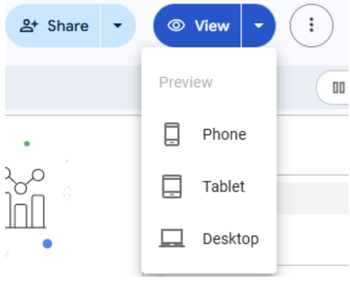
Adaptive viewing for PC, tablet, and mobile from the View button.
- Structure based on sections, which function as component containers.
- Each section follows a 12-column grid for aligning elements.
- The height of each section adjusts automatically based on its content and cannot be manually modified.
Functional Advantages
- Filters by section: Each section can have specific filters, allowing for a modular design, although a general filter can also be applied to the entire page.
- Mobile compatibility: While there are details to iron out, the experience significantly improves on small screens.
- Independent customization: You can define colors and borders per section, and easily organize them.
Current Limitations of Responsive Mode
Despite representing a significant advancement, responsive mode presents restrictions to consider:
- You cannot add lines or arrows, nor overlapping components (the "send to front" or "send to back" options are disabled). This limits creative freedom, as you cannot overlap charts, buttons, or text boxes.
- It is not possible to manually adjust the canvas size or the exact position of elements.
- There is no option to freely group components: everything must be located within sections.
Visualizations always adjust to the device's width, which can create unnecessary empty spaces on large screens.
In contrast, on tablets, the display usually adjusts correctly.
- You cannot create report-level components; you cannot fix elements like logos or headers to appear on all pages.
Visual and Usability Considerations
During testing, certain visual issues were observed, especially on mobile devices:
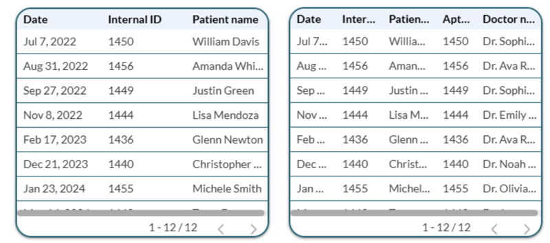
- Tables with more than 3 columns lose clarity, hiding relevant data like dates or last names.
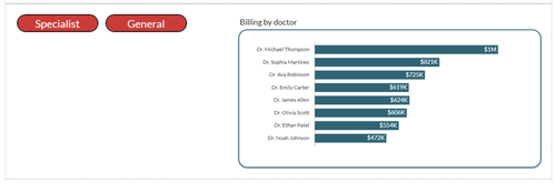
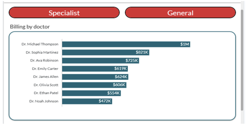
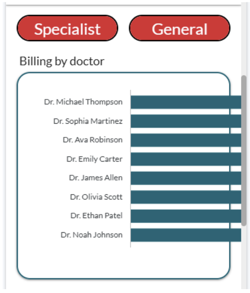
- Horizontal bar charts overflow the screen on mobile.
- Time series charts or vertical bar charts with few columns display correctly.
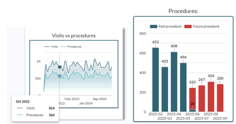
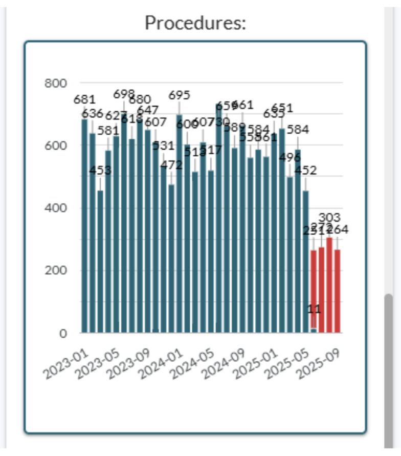
The problem appears when many columns are displayed in vertical bar charts.
Conversion and Precautions
- A Responsive report can be converted to Freeform from the "Layout" tab. However, this change is irreversible, so it's recommended to make a copy before proceeding. Conversely, the inverse process isn't possible, meaning if you want to create a Responsive report from a Freeform one, you'll have to start from scratch.
- To use responsive mode, all pages in the report must be of the same type.
Final Recommendations
Looker Studio's responsive mode represents a significant step towards cross-platform design. However, its current use is recommended for:
- Simple dashboards.
- Projects that don't require element overlap or advanced customization.
It still has limitations, especially in its mobile version, where several components lose legibility or overflow. In the future, we expect improvements that will make this functionality more flexible and robust.
Dynamic Data Team